Segment Summary:
About the Project
Hi, my name is Thomas, welcome to my books project! This work attempts to visualize something many of us have felt or experienced - the ways in which a book might make us feel. How do great authors use cadence of emotions to make you laugh and then cry, and are there universal patterns for what "great" writing looks like?
To study this, I borrowed some recent advancements in the computer science world of Natural Language Processing. Facebook's large language model BART lies at the core of this project for two primary tasks.
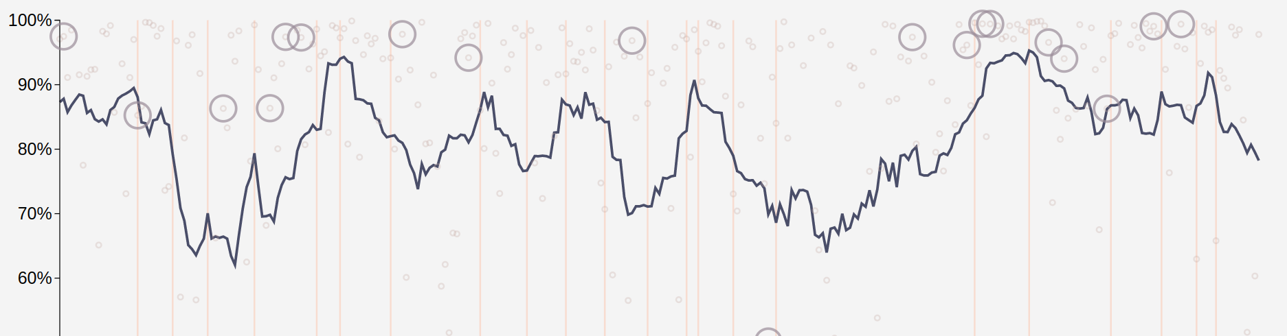
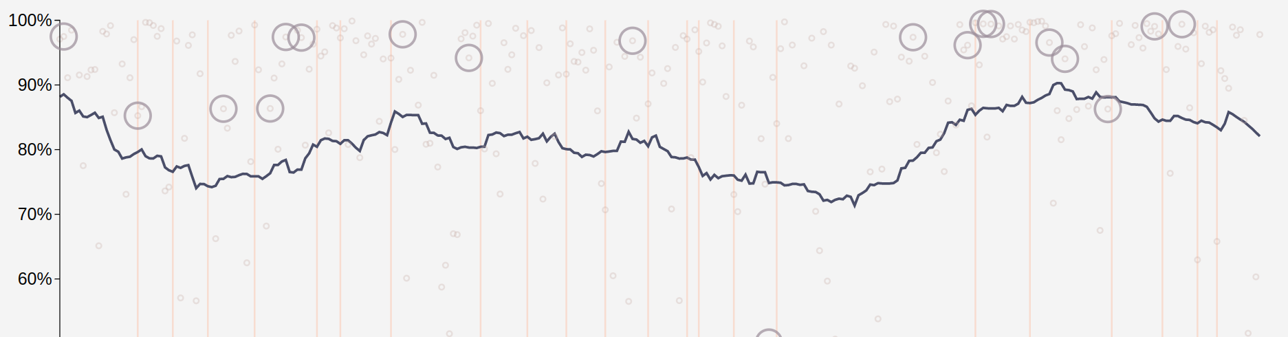
By plotting these points out and examining a moving average of their behavior, we can get a sense of how concepts are growing and evolving through the course of the book. Details on the implementation and the full code is publicly available for your convenience at this GitHub repository.
Contact Information
For more information, connect with me on social media: